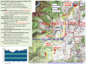
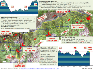
I’m one of the lucky ones who got into Way too Cool 50K next Saturday. The official course map I found hard to read, and a little annoying in the way it was cut up. Personally, I like to see course elevation, directions and distance between aid stations all on one page.
It appears the first loop is more prone to errors than the rest of the course despite being only 8 miles, judging by the directions, so for these reasons I put the first loop on page 1 and the second on page 2.
These are definitely not pretty, but hopefully they are functional and readable while running 🙂
Obviously a huge thanks and credit to the writers of the instructions, and the Fit 2 Run, Inc. folks who did the topo maps, hence the source credit on the bottom of each page.
Please let me know of any errors you find, or if you know the actual mileage marks of some of the turns as I had to guess some of them by eyeballing the map and interpolating the instructions. I’ve uploaded it as a PowerPoint show (.ppsx) so you can edit in PowerPoint with your own annotations or just print it as is.
Hoping you may find these useful, and hoping to see you out there on March 12th 🙂

